Abstract
Research continues to demonstrate the benefits of mask wearing in stemming the spread of COVID-19, and yet while 35 states and D.C. have passed laws mandating the wearing of masks (under varying conditions), the United States has yet to see a consistent drop in new coronavirus cases below April 2020 levels. By looking at the relationship between survey responses on mask wearing, state-level mask mandates, and county-level demographics and 2016 political affiliation, 46% of the variability in whether you’ll run into a person wearing a mask in a given county can be explained. The variables with large effect sizes which were significant include:
Statewide Mask-Requirements: States which had passed a law mandating the wearing of masks to some extent (prior to the survey) saw an 9% increase in the percentage likelihood that a random person encountered in a county within that state was wearing a mask.
Population Density As a county’s population density goes up one classification (gets more rural) we could expect a 2.75% decrease in the percentage likelihood that a random person encountered in that county was wearing a mask.
2016 Election Results: For every 10% increase in a county’s vote for Trump in 2016, there could be an expected 1.7% decrease in the percentage likelihood that a random person encountered in that county was wearing a mask.
Introduction
The first case of COVID-19 (the disease caused by the novel coronavirus) in the United States was January 20th, 2020, and within four months states began passing laws mandating the wearing of masks—with numerous studies supporting the efficacy of wearing masks to stem the spread of the virus.[1] But despite guidance from regulatory authorities, and outright legal requirements across the United States, mask wearing has been inconsistent. A Gallup poll conducted in mid-April found that just 36% of U.S. adults wore masks every time they were outside their home—with 31% reporting they never wore masks.[2]
What factors about a person determines their adherence to mask wearing is a question that’s been looked at from various perspectives: gender, education, partisanship chiefly among them.[3] What has been studied less is county level information—for a given community, what factors impact the likelihood that a random person encountered would be wearing a mask?
This paper takes survey research done at the behest of the New York Times, which gives county level data on the frequency by which people wear masks, and investigates the relationship that data has with state-level legal data on mask mandates, county-level election data from 2016, and county-level demographic data including population, rurality, education, and wealth.
Methodology
Mask Wearing Survey Data
The data for the dependent variable investigated, the likelihood that a random person in a given county is wearing a mask, was created using survey data provided by the New York Times, and generated by the global data and survey firm Dynata.[4]
Dynata, at the request of the New York Times, asked 250,000 people across the United States “How often do you wear a mask in public when you expect to be within six feet of another person?” between July2 and July 14, 2020. The data provided was at the county level (using the FIPS code) and included the portion of responses in each county for the five given options for response to the question: Always, Frequently, Sometimes, Rarely, and Never.

Though not provided in the dataset, the New York Times’ story covering the survey consolidated the five possible responses into a single variable: the likelihood that “everyone is masked in five random encounters.”[5] In the methodology section, their unified variable was derived by assuming the following:
“…survey respondents who answered ‘Always’ were wearing masks all of the time, those who answered ‘Frequently’ were wearing masks 80 percent of the time, those who answered ‘Sometimes’ were wearing masks 50 percent of the time, those who answered ‘Rarely’ were wearing masks 20 percent of the time and those who answered ‘Never’ were wearing masks none of the time.”
Given that what is of interest in this research project is the relative chance someone is wearing a mask across counties, a simpler conditional probability was derived by first multiplying the percentage of responses in each category (Always, Frequently, etc.) by the percent of time that answer corresponded to (using the New York Times’ methodology—100%, 80%, etc.), then adding each multiplied total together. This gives the dependent variable used in this research project: the likelihood that one random person encountered is wearing a mask.

State Laws Requiring Masks Data
Although this research project looks primarily at the county level, state level data was used for the binary variable of “Mask Law” given a lack of consolidated information on which counties, municipalities, and townships had passed laws requiring the wearing of masks. The state-level data was provided publicly by the volunteer organization #Masks4All, which lists which states require masks in public, when that law was first passed, and the type of requirement.[6]
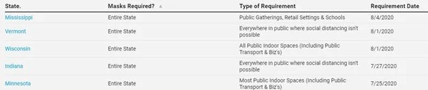
For this project, the type of requirement was ignored, and any state which had required masks statewide before the survey was taken (July 2, 2020) received a “1” while all other states received a “0.” 19 states and the District of Columbia had mask laws passed before the survey, while 30 states did not. Alaska was excluded from the full dataset given lacking data on survey response.
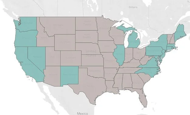
County-Level Demographic and 2016 Election Results Data
To compare survey responses to partisan leaning, data was pulled from The New York Times, which came from several sources collected by Emil O. W. Kirkegaard at the Ulster Institute for Social Research on the project Inequality across US counties: an S factor analysis.[7] The variable used was “Republican 2016:” the percentage of votes cast in a given county for the republican candidate (Donald Trump.)
A collection of variables noting demographic information at the county level was also taken from this source, and included:
% of Population with a Bachelors Degree
Median Earnings (2010)
Total Population
Median Age
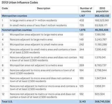
Given prior news coverage anecdotally reporting that rural areas were resisting mask requirements[8], additional data was taken from the Economic Research Service[9], a part of the United States Department of Agriculture, which provided a county level label for Urban Influence in 2013.[10] This Urban-Influence code “distinguishes metropolitan counties by population size of their metro area, and nonmetropolitan counties by size of the largest city or town and proximity to metro and micropolitan areas,” with “1” indicating a large metro area, and “12” indicating the most remote counties.
For the purposes of this project, “1” and “2” coded counties were kept without transformation, and counties with codes ranging from “3” to “12” were bucketed as “3.” This classification highlights the differences between large cities, small cities, and rural communities which vary in proximity to metropolitan and micropolitan cities. In this project the label “Population Density” was used.
County-Level COVID-19 Cases and Deaths Data
To investigate whether the amount of COVID-19 cases and deaths in a county effects the likelihood of someone in that county wearing a mask, coronavirus case and death data as of July 1st, 2020 was taken as well. This data came from the New York Times as well,[11] and was converted using the population variable from the Kirkegaard paper to get “Cases per 100k” and “Deaths per 100k” at the county level.
After rescaling variables with proportional data to a scale of 1 to 100, and removing counties which had null values for any variable (including Alaska and 16 additional counties which lacked coronavirus case data), the full data set was used for analysis.


Exploratory Analysis
Mask Wearing and State Laws Mandating Masks

Using a box and whiskers blot to explore the relationship between states with laws requiring masks and counties percentage likelihood that a random person encountered would be wearing a mask yielded immediate and expected results. Generally, counties in states with laws passed saw a higher likelihood of mask wearing.
The interquartile range for counties in states where a law had been passed (1) was entirely above the interquartile range for counties in states which did not (0). The median mask wearing likelihood in counties with laws passed was 85.23%, in comparison to 72.2% in counties where no laws had yet been passed.
There was a larger spread among the no-law counties, with the Upper Whisker of the plot showing Hays County, Texas with a 95.94% likelihood of mask wearing, in comparison to the 96.63% upper whisker in the counties with laws (Yates County, New York.)
The county with the lowest mask wearing (Wright County, Missouri at 35.63%) was in a state which had no law requiring masks at the time the Dynata survey was taken.
Mask Wearing and 2016 County Election Results
A recent survey by Gallup showed that “75 percent of Democrats said they had worn a mask in public, while 58 percent of independents and less than half of Republicans said the same.”[12]
In order to investigate if the results at the individual level from this survey held at the county level, a scatterplot and simple linear regression was done looking at the percentage of the vote at the county level for Trump in 2016 and the percentage likelihood that someone in that county would be wearing a mask.
26% of the variability in the survey data could be explained based solely on the 2016 election results, and showed a significant negative relationship (p-value < .0001): for every 1% increase in votes for Trump in 2016, a county could expect a .75% decrease in the likelihood of someone wearing a mask in that county.
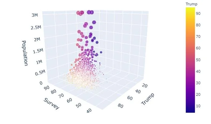
The scatterplot also highlighted that counties with lower votes for Trump had larger populations populations (the size of the dot) and that the spread of the data for counties with lower votes for Trump was much tighter than the distribution among counties which overwhelmingly voted for Trump.
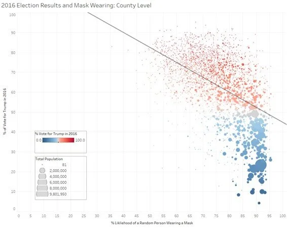
Visualizing the data with a third axis for population further highlights the relationship population has to the other variables: higher population counties overwhelmingly wear masks and voted for Trump in low numbers in 2016. (Note that for visualization purposes, all counties with a population over 3.4 million were brought down to that threshold.)
Mask Wearing and County-Level Demographics
Education: Percent of Population with a Bachelors Degree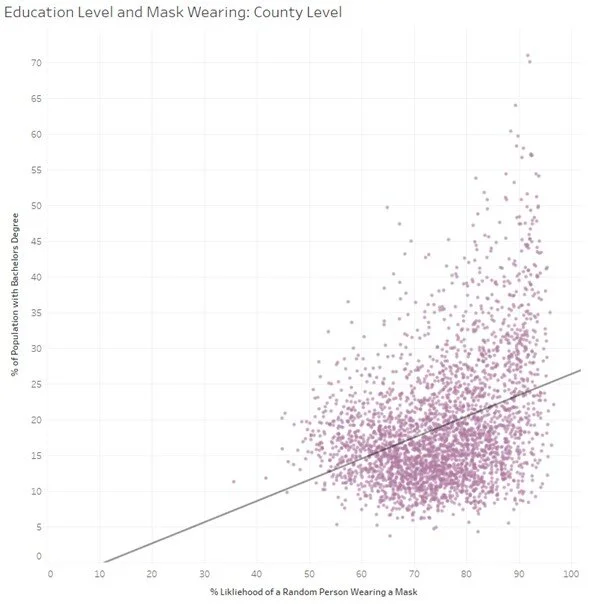
By investigating the percent of the population with a bachelors degree in relation to the percentage likelihood that a person in that county would be wearing a mask, it appears that, while significant, increased education does not indicate as large an increase in mask wearing as votes for the a party other than Trump’s in 2016.
13% of the variability in the survey data could be explained based solely on the percentage of the population with a bachelors degree, and showed a significant positive relationship (p-value < .0001): for every 1% increase in a counties portion of the population with a bachelors, a county could expect a .30% increase in the likelihood of someone wearing a mask in that county.
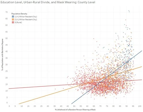
What is perhaps more interesting is that this relationship is stronger the more metropolitan the county is. The less rural the county, the less significant the relationship between the variables are, and the direction of the relationship becomes weaker. This indicates collinearity between how urban or rural a county is and the degree to which that population pursues higher education. With most universities in more urban locations, this makes sense.
Population Density: County Level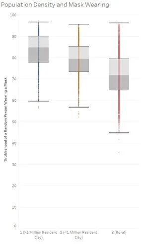
There is a clear downward trend in the box and whiskers plot looking at counties of varying rurality and the percent likelihood that a person in that county would be wearing a mask, with the median in each more rural classification getting lower than the one before it. As counties get more rural, they have a lower likelihood of wearing a mask. That being said, the rural counties show the widest distribution of mask wearing likelihood.
Multiple Linear Regression
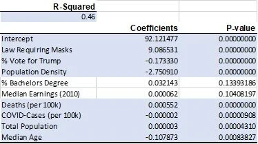
By looking at all of these variables together, the highest R-squared yet is found, with 46% of the variability in survey data able to be explained. The coefficients of the significant variables (shown below) indicate the following relationships:
States which had a law passed prior to the survey saw a 9% increase in the % likelihood that a random person encountered in a county would be wearing a mask.
For every 10% increase in a county's vote for Trump in 2016, we could expect a 1.73% decrease in the % likelihood that a random person encountered in a county would be wearing a mask.
As a county's population density goes up one classification (gets more rural), we could expect a 2.75% decrease in the % likelihood that a random person encountered in a county would be wearing a mask.
For every 1,000 covid-19-related deaths per 100k population in a county, we can expect a 0.55% increase in the % likelihood that a random person encountered in a county would be wearing a mask.
For every 10,000 cases per 100k population in a county, we can expect a 0.019% decrease in the % likelihood that a random person encountered in a county would be wearing a mask.
As a county's population increases by 100k, we can expect a 0.34% increase in the % likelihood that a random person encountered in a county would be wearing a mask.
Conclusion
There are numerous conclusions, beyond the variable significance and effect size, to be drawn. At the highest level, mask laws work, though perhaps not to the extent they should. In the realm of partisanship, there is also a clear result: the more conservative a county, the less likely they will be wearing a mask. And while this coincides with other survey results at the individual level, the distribution of survey responses in conservative counties tells a different story: there are outliers which have high mask wearing, and who overwhelmingly voted for Trump. Jack County, Texas voted for Trump at 90% in 2016, and yet sees a 90% likelihood of a person encountered wearing a mask. This county, and others, could be used as a starting point for further research into the partisan divide: why did mask-related health communications work better (if at all) in these counties?
And finally, while the demographic data largely confirmed common sense (more educated the population, the more urban it is, and the higher the population indicated a higher level of mask wearing) if provides a quantitative backing for unproven assumptions.
Future Research
While the simple binary classification of “no law” and “law” makes it a more straightforward data science task, there are nuances to each state’s mask requirements: from whether masks are required for all indoor settings, within 6 feet of anyone else, or only in public spaces. These nuances, if properly coded, could give more direct insight into which laws work and where. But generally, we can expect an almost 9% increase in mask wearing when a law is passed. With an additional round of survey collection by Dynata, laws passed since July 2nd could be tested against this prediction.
[1] http://files.fast.ai/papers/masks_lit_review.pdf
[2] https://news.gallup.com/poll/310400/new-april-guidelines-boost-perceived-efficacy-face-masks.aspx
[3] https://news.gallup.com/poll/310400/new-april-guidelines-boost-perceived-efficacy-face-masks.aspx
[4] https://github.com/nytimes/covid-19-data/tree/master/mask-use
[5] https://www.nytimes.com/interactive/2020/07/17/upshot/coronavirus-face-mask-map.html
[6] https://masks4all.co/what-states-require-masks/
[7] https://openpsych.net/paper/12
[8] https://www.npr.org/2020/05/27/862831144/why-parts-of-rural-america-are-pushing-back-on-coronavirus-restrictions
[9] https://www.ers.usda.gov/data-products/county-level-data-sets/download-data/
[10] https://www.ers.usda.gov/data-products/urban-influence-codes/
[11] https://www.nytimes.com/article/coronavirus-county-data-us.html
[12] https://www.nytimes.com/2020/06/02/health/coronavirus-face-masks-surveys.html