Artificial intelligence (AI) is simply a computer program which can perform tasks which historically required humans to carry out. But as AI continues to progress, questions have arisen regarding not only the value these AI systems can provide in terms of efficiency and increased profit—but also the potential harms.
Ranging from bias in models determining sentencing guidelines for criminal procedure to the more apocalyptic images aroused by movies like Terminator, The Matrix, and Ex Machina, AI has become a wide-ranging topic with connotations toward societal collapse as well as utopia. Reflecting this diverse set of judgments on AI is the news media. But is there a way to quantify and categorize how positive or negative certain publications coverage of AI is?
ABOUT THE PROJECT:
This project tries to address the question “how is AI covered in the News?” through the use of some basic text preprocessing steps and two out-of-the-box sentiment analyzers, TextBlob and Vader. While
Sentiment analysis helps determine if a given text is either positive, negative, or neutral, and can also point to the level of subjectivity the text displays. While for simple phrases like “I hated it” or “I loved it!” the sentiment is easily and accurately quantified, with real life data (especially news headlines) it’s harder to get at the right answer.
About the Data
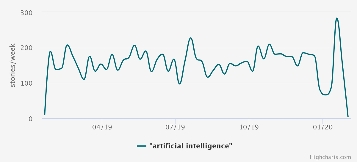
Media Cloud generated chart on "artificial intelligence" coverage over time. This shows stories from the top U.S. newspapers and digital native sources of 2018, based on research from the Pew Research Center published in Aug. 2019.
An available and up-to-date resource for getting large amount of news data is is Media Cloud, an open source platform for studying media ecosystems. Media Cloud’s explorer tool allows for access on stories published containing a given keyword, in a given collection of media outlets, over a given time frame; the selections for this project are below.
Keyword: “artificial intelligence”
Media Collection: U.S. Top Sources 2018
Time Frame: 2019-01-17 through 2020-01-17
These selections generated approximately 8,500 articles, containing attributes including headline, publication date, publication, URL, and keywords the publication used to tag the story (in cases where they did tag the story.) Only headlines containing “artificial intelligence” or “ai” were considered, and duplicate headlines were eliminated—bringing down the total to 1,605 stories.
The 1,605 articles covering AI came from 65 publications. Some publications covered the topic more often: 58% of the publications published headlines with “ai” or “artificial intelligence” ten times or less, while 5 publications were responsible for almost half of the today stories.
Explore the data
Open in Tableau ↗Loading and Preproccessing
To determine the sentiment of the article, only the headline was considered. To prepare the data for sentiment analysis, the following data preprocessing steps were followed:
Read the csv (downloadable from Media Cloud directly) in with pandas as a dataframe.
Convert all uppercase letters to lowercase in the headline.
Remove all special characters (punctuation etc.) from the headline.
Using nltk’s stopword list, remove all stop words from the headline.
Analysis & Models
Two python sentiment analyzers were used to score each headline’s sentiment: TextBlob and Vader. Neither of these models required further preprocessing (tokenization and vectorization) to determine a sentiment score, but rather relied on predetermined lexicons of words already scored as positive, negative, or neutral.
TextBlob
TextBlob returns two metrics related to the language used for each headline: polarity and subjectivity. Polarity scores the headline on a scale of -1 to 1, with negative values indicating a more negative sentiment and positive ones indicating a positive sentiment. Subjectivity scores the headline on a scale of 0 to 1, with higher values indicating more use of personal opinion, emotion, or judgement.
Vader
Vader returns four metrics related to the language used for each headline: negative, positive, neutral, and compound. The first three metrics are related to the proportion of words in the sentence which fall into that category—added together, three metrics will always add to 1. The compound score calculates the prior three metrics into a normalized value between -1 and 1. Like TextBlob’s polarity measure, the compound score indicates if the headline’s sentiment is more negative (closer to -1) or positive (closer to 1.)
Results:
TextBlob and Vader showed large differences in their scoring of the 1,605 headlines. Most notably, TextBlob scored more negatively overall, while Vader was more positive. See below for a plot showing the different scores each model gave per publication (using the average polarity and compound score based on their respective headlines.)
Explore the data
Open in Tableau ↗As evident from the scatter plot, it’s clear that in many cases Textblob and Vader scored publications completely different—the clearest example of this is The Atlanta Journal Constitution. While the average score for this publication 0.4 in TextBlob, Vader scored it -0.66. The story which was scored had the headline: “Google AI Detects Breast Cancer More Accurately Than Doctors.” From the headline alone, TextBlob seems to be more accurate, given that detecting breast cancer accurately is a good thing, and reflects positively on artificial intelligence.
A separate example is the New York Times, which was scored negatively by TextBlob (-0.26) and positively by Vader (0.35). In this case, there were 5 stories that had a value of 1 or greater for the absolute difference between the Vader and TextBlob score.
Explore the data
Open in Tableau ↗In this case, a manual check using common sense shows that Vader appears to be much more accurate, given that is scored stories like “How Artificial Intelligences Could Transform Medicine” and “How artificial Intelligence Can Save Your Life” as positive, while Textblob scored them negative. None of the five stories appear clearly negative, even though TextBlob scored them that way with a strong negative score of -0.60.
But the New York Times and The Atlanta Journal Constitution are only two publications out of 65, covering a small fraction of the total amount of headlines scored. See below for the distribution of average sentiment scores for all publications under both models.
Explore the data
Open in Tableau ↗Explore the data
Open in Tableau ↗Further checking would need to be done manually to determine how accurate the sentiment scores are for each model, given that from spot checking it’s clear neither performs perfectly. At first blush, it does appear that Vader is more accurate. There are some further issues with this analysis given the nature of news writing: oftentimes headlines are more positively or negatively connotated than the articles themselves—given the need of news publications to drive traffic and readership; many American readers are more likely to click on a grabby emotional headline than an objective statement. So headlines themselves can be representative, but not in entirety.
Conclusion
Employing sentiment analysis at this level, using pre-made tools that simply take in the headline as a whole and spit out some measures of sentiment, is no replacement for manual analysis. Rather, sentiment analysis at this level can quickly label stories as positive, negative, or neutral with varying accuracy to then manually check. Further developed sentiment classification can increase the accuracy, see here for subsequent projects on the topic.